
Bringing a legacy automation system to a modern, responsive web platform.
The details
Date
Sep 2017 - Oct 2018
Methods & Tools
User Flows
Wireframing
Design Systems
PowerBI
Collaborators
UX Designer (my role)
Senior UX Designer
Senior UX Designer
Product Manager
Developers
The task
My first full-time client at Solstice (now Kin + Carta) was Rockwell Automation; a leader in the automation industry. I was part of a team tasked with creating a responsive web platform named myRockwellAutomation built to house Rockwell’s product catalog, repair and order center, and management of over 600,000 user accounts. I worked with a full agile scrum team including product analysts, a scrum master, QA, and development teams across two continents for over a year.
The problem
Rockwell Automation’s users utilized the company’s services and products to create and view equipment orders and manage the lifecycle of the products in their factories. The current process Rockwell’s users encountered when doing these tasks was manual and cumbersome, often involving phone calls or emails, wasting precious work time. Our team was tasked with taking the analog processes of viewing orders and evaluating a factory’s lifecycle and turning it completely digital.
The design outcome
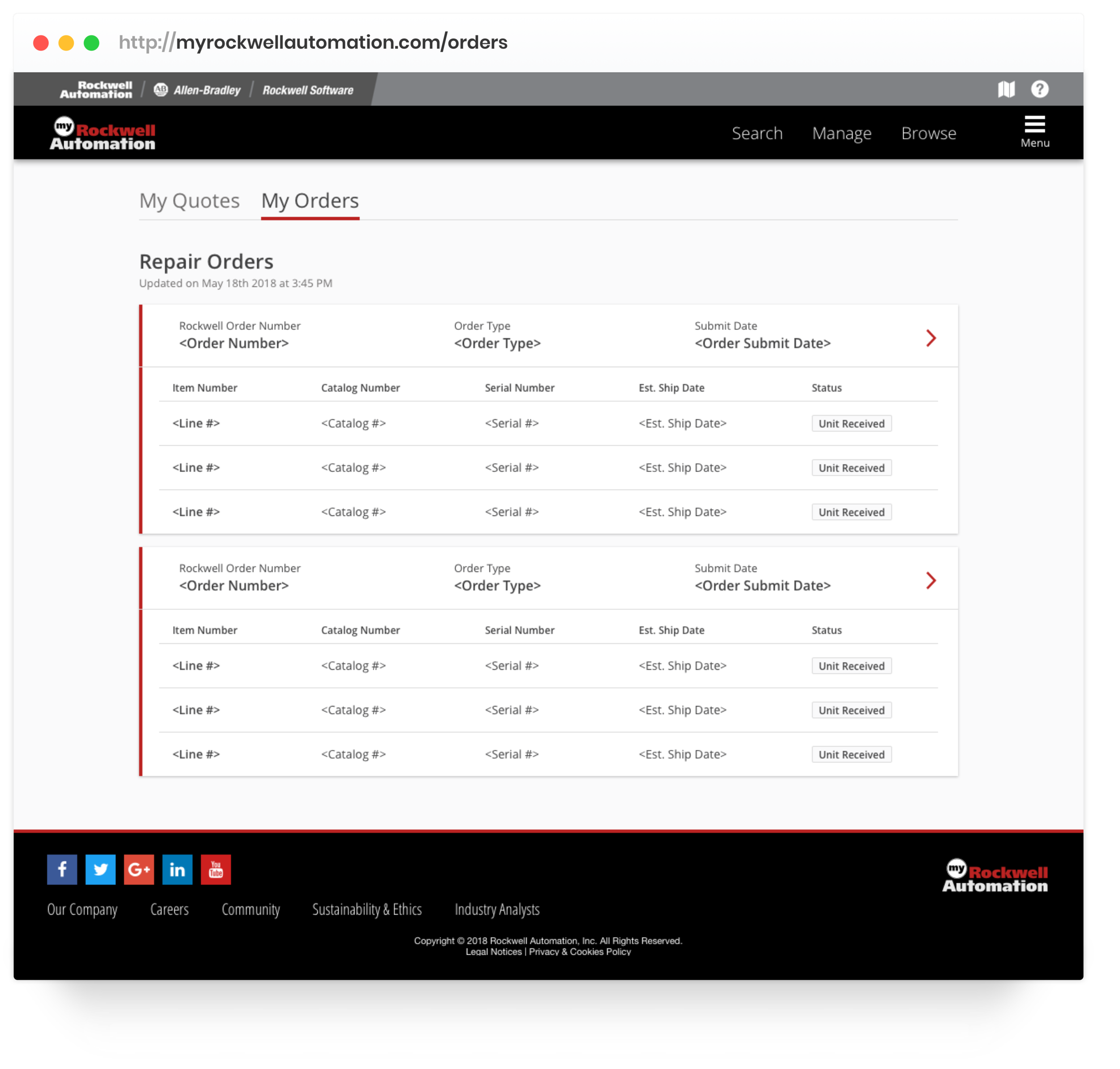
My Orders
With My Orders, users have immediate insights into the status of their orders without the need to call customer service.
List views with quick, scannable, labels allow users to check the status in a speedy, efficient way.

My Equipment
With My Equipment, users could learn when they needed to replace parts in their facility, updated in real-time via PowerBI.
The dashboard view crafted a story for the user around the lifecycle of their facility, with the ability to access detailed information about each of their parts.
The process
Rockwell Automation, a 100+-year-old company, provides hardware and software for industrial automation products. Over the years, this massive company acquired various smaller companies, leading to a disjointed and confusing user experience. Kin + Carta was brought in at the very beginning of the journey, spinning up a team to help design and build a new digital platform, which would later be called myRockwellAutomation. My involvement with this project began creating designs for a Repair Quote Wizard under Senior UX Designer, Jenn McHale-Marin, and I grew to be the sole designer on my own scrum team responsible for the My Repairs, My Orders, and My Equipment features.
Feature Needs
Before myRockwellAutomation, customers of Rockwell Automation’s products and services had multiple accounts for every separate experience included under the Rockwell umbrella. These disparate experiences cost customers 3 million man-hours a year. The customers, were used to filling out all of their quotes via paper or by calling in to make an order. Most of the user testing done in order to understand what our users needed was conducted at Rockwell’s annual conference, Automation Fair. Through these user sessions, we learned a few characteristics that were unique or important to our users, including efficiency, role-specificity, and large data sets.
Efficiency
Our flows needed to be fast and efficient to allow for users to enter the system, complete the necessary actions, and leave.
Role-Specificity
Oftentimes the customers using Rockwell’s products and services were deeply specialized, meaning there may be a role at a factory whose entire job was to use our new system and enter information in for repair quotes.
Large Data Sets
In order for our experience to function correctly it was going to need to pull from large sets of both product and user data. This connection will need to be scannable and load fast.
The base
My role with Rockwell began with the RFQ (Request for Quote) wizard, and my task was to see the final designs into production. The quote wizard was an important first step in solving our users’ needs, and was the base for the future My Orders and My Equipment features in myRockwellAutomation.
My Orders
After the RFQ wizard was successfully brought into production, our team was next tasked with building upon that platform. The current process for submitting a Request for Repair Quote was incredibly manual, requiring countless hours of customer service time to figure out exactly what the user needed. However, with the implementation of the RFQ wizard, the information needed to complete an order was already all digital. Our team was brought in to create the system for customers of Rockwell to view their list of orders and track when their orders were expected to arrive after the information was inputted by Rockwell.
Key Elements
My team helped develop the end-result for the orders once they were inputted to the system. This list would give the user info about the status of their orders throughout the process, and keep them informed of any changes. Through speaking to users, we learned and updated our designs to focus on two key elements for the My Orders experience:
A status tracker for the lifecycle of the order
In their current experience with Rockwell, the users were completely in the dark about the orders process. In order to receive the status of an order, they would call customer service, increasing call volume and costing Rockwell precious money and time.
Shallow levels of detail
These levels were: a high-level list for scanning, and detailed screens for every order.
Some users only scanned to input certain numbers, while others referenced specific details to create more informed future product inventory.
Information Architecture
Once we were able to narrow down some initial elements needed, we began to build out the information architecture of the experience itself.
During the architecture creation, we also realized we would need to break down our experience into a Now, Near, Next approach.
The data sets available to us at the time wouldn’t be able to handle what we wanted them to do, but potentially could in the future with further demystification and back-end work (which is where the future enhancements came into play).
Low-Fidelity Iteration
Once the client approved of our information architecture, we were able to begin wireframing how the elements listed above would be composed on the screens themselves. Since myRockwellAutomation was designed as a responsive web platform due to our users’ needs, we were tasked with creating small, medium, and large versions of every design (this was well before the glory of Figma’s autolayout feature). I used a blue color for my wireframe designs when presenting in weekly client design reviews in order to keep conversations around visual design limited. This encouraged the client to give more targeted feedback on the structure of the page instead of on things like color and image choice.
Developing High-Fidelity Designs
On my full scrum team, I worked with my coworkers in Buenos Aires to develop and test the screens I designed. Working through my product consultant who took my designs and translated them to user stories, I would meet on a weekly - sometimes daily - basis to conduct video UI reviews down to the pixel on designs as they were being developed. My developers and I would have a running game of “How many defects can I spot?” in these UI reviews, and I would “win” if the number was over a certain amount (though it almost never was, as my team was very talented).
Animation Interaction Notes
An added benefit of working with my own developers was the chance to try new skills such as the creation of animations.
Under the guidance of designer Christian Nam, I was able to create detailed interaction notes for my animations in order to clearly describe how the animation should be built out in development.
My Equipment
Once the My Orders project was fully developed and released live to the main myRockwellAutomation experience, it was time to shift gears and work on another expansion of myRockwellAutomation, My Equipment.
Legacy Experience
The My Equipment experience was intended to allow users the ability to see the lifecycle of their entire Rockwell inventory. The process was cumbersome, requiring a Rockwell employee to go out to a factory, complete an inventory and lifecycle check of every part owned by this factory (called an Installed Base Evaluation).
The results of that data was often a spreadsheet, pdf, or printed document that was outdated almost as soon as the factory received it (an example seen to the left).
With My Equipment, all of the data being housed in the Rockwell system was to be surfaced to the users in an interactive experience, allowing users to filter down their inventory by various areas of their plant and lifecycle statuses. Working with the subject matter experts (SMEs) on the Rockwell side, we created a rough outline of how this information could be surfaced to our users in My Equipment.
Alpha Release
Our timeline was broken into a three month cycle including user testing on an alpha release happening near the end of the cycle. For this release, we worked in a similar fashion of information architecture creation and wireframing and layered the complexity of designing in Microsoft PowerBI. The team brought on a PowerBI developer to work with our web developers, and we designed how we wanted to leverage the charts and visuals offered by the platform.
Our first pass at the experience included a tabbed experience, breaking down different sections of the plant for our users, including:
How the lifecycle of their products were broken down
Which of the parts were verified vs. unverified in the plant
Which products were at the most risk of needing replacement
Which panels in their facility needed repair
Lackluster Feedback
With PowerBI came countless design difficulties and setbacks, and we found many of our wireframes and even high-fidelity designs were simply not possible to build within the interface. My job was to work directly with the PowerBI developer, manipulating the platform enough to create consistency with the rest of the website and our design system.
After the alpha release, we collected surveys from the internal stakeholders and quickly realized that our experience was simply not good enough. While we were successfully showcasing the information given from a manual Installed Base Evaluation digitally, we weren’t giving the user helpful insights, and the PowerBI visual design was lacking. A quote from the research readout read that we were still “missing the mark on where we need to go.”
“The vision for using PowerBI was originally that we would embed individual reports into the website seamlessly - The way it currently sits is easy to tell this is just PowerBI.”
Pivoting under pressure
With only two weeks before the release sprint for the beta release, our team spent 12 hours in a workshop with our POs figuring out the best possible user flow for making our designs the most intuitive and helpful as we possibly could. This workshop included physically cutting and pasting pieces of the experience (the My Equipment elements mentioned above) onto large giant pieces of paper (the different tabs or pages of the experience) and working through how these different elements interacted together as a team.
The final dashboard
After this workshop, our new plan was to create a dashboard linking out to separate pieces of the experience in more detail. This dashboard view was the missing link to our designs - it allowed our users to see a high-level of their plant while still being able to drive deeper and “slice” to learn more. It also took the feedback given from the alpha release, and gave users more insight into the lifecycle of their plant as a whole
While we still weren’t 100% sure if this was possible in PowerBI, our developer was on vacation for three weeks, leaving myself with no choice but to download a virtual Windows machine on my Mac and design the new concepts straight in PowerBI itself. This extra work proved to be pivotal for our team making our beta release deadline, and allowed me to learn a new skill in a new program. After the release of myRockwellAutomation, the software helped Rockwell save 3 million man-hours a year.
What did I learn?
The Rockwell project was a challenging one from start to finish. Our team had a great relationship with the client, but it wasn’t all sunshine and roses. While other projects may have tested my tactical design skills, this one tested and taught me how to be a true consultant. From stakeholder interviews to design reviews, I learned how to both thoughtfully listen and how to tell a story with my work, which have both benefited me tremendously later in my career. I also learned the importance of growing and supporting a healthy team. The success of this project lived in the care and support our team gave each other, and I’ve taken that mindset to future teams I’ve been on and led.