Revolutionizing how customers make payments on the go.
The details
Date
Aug 2019 - Mar 2020
Methods & Tools
UX Design
UX Research
Animation Design
KPI Strategy
Team Structure
UX Designer (my role)
UX Researcher
UX Writer
Developers (client team)
91%
positive rating of 102 tested users on our redesigned landing page
124
total users tested through a variety of research methods including usability and jobs-to-be-done
2
main user needs of “connecting the balance” and a “one-stop-shop” successfully uncovered and solved for
#2
highest-ranked feature in mobile app based on customer satisfaction according to JD Power & Associates
The task
In the fall of 2019, I was tasked with redesigning a Fortune 500 financial company’s Bill Pay feature in their native mobile application. Over the course of around eight months, I was the lead designer and worked with a UX Researcher to discover, evaluate, and measure a newly redesigned Bill Pay experience relevant to our users’ needs.
The problem
The bill pay experience in our mobile app was outdated and riddled with bugs. It hadn’t been touched in years, and didn’t have many of the same features as available in the web experience. The bill pay feature was, at the time of redesign, the fifth most used feature in the app, and was the second highest-ranked feature in terms of impact on customer satisfaction (according to JD Power & Associates). Knowing how much this feature could affect overall customer satisfaction, we had the task of bringing our bill pay up to par with the web experience and competitive with other banks.
The design outcome
Elevated Visual Design
The new mobile bill pay experience brought the tired, utilitarian design up to par with the rest of the app’s visual design.
Larger, tappable areas and floating action buttons brought the main actions of the page to the user’s fingertips.
We learned through user testing that the main needs for bill pay users were to make a payment, check scheduled payments to see how much they were able to afford each month, and make sure their recent payments went through. A landing page broke down silos created by the original design.
The process
I broke down my workload using a version of Jesse James Garrett’s Elements of User Experience. My process for working included six steps titled Strategy, Scope, Structure, Skeleton, Surface, and Support.
Strategy: Figure out the why of the project from a business and user perspective; take a look a the competitive landscape; evaluate the current experience for pain points and potential gain points
Scope: Define what the technical scope of the project is; define relevant content to be leveraged; develop realistic timelines and create MVP vs. enhancement requirements
Structure: Create user flows to compose the information architecture of the experience
Skeleton: Wireframe mockups of the designs to run concept and usability testing sessions with users
Surface: Create high-fidelity designs and prototypes to run more detailed user sessions with and obtain approval
Support: Ensure a detailed KPI strategy is defined with the client’s analytics team and conduct UI reviews with developers as the feature is built


Strategy
The first phase of our work was to define the future state of the Bill Pay feature. Our team ran multiple sessions both internally and with the client to narrow down what the key drivers were for the redesign: What were some elements that we specifically think needed to change from the current experience? What would happen if we didn’t redesign it? We also discovered some of the user personas we were working with based on past research, and used them to influence how we narrowed down our main user goals.
Narrative Exploration
After working through some of the “whys” around the redesign, I then observed the current narrative for the user, and worked with our UX Writer Jessica Smith to craft how we wanted that narrative to be imagined within our redesign, such as emotions and messaging (shown on the left). We also conducted extensive competitor research to see what other financial apps have released in terms of Bill Pay.
User Personas
Our next task was to follow up on any past research done on the feature, web or mobile. In digging up this past research, we learned of two main bill pay user personas we were potentially working with: users who haven’t used bill pay before, and users who have used bill pay before. These personas influenced our mindset of who our users were before going into the discovery interviews where we talked to actual bill pay customers.
Non-Bill Pay Users
Distrusted banks
Prefer the control to make payments on their own
Afraid of the risk of giving their account information to a bank
Bill Pay Users
Trust banks
Value convenience and ease, and prefer to consolidate their information in one place
More protective of their bank account information as it houses many access points
Jobs-To-Be-Done Interviews
A major part of the Strategy phase was to run discovery interviews with current Bill Pay customers, both from our client and from outside competitors. These discovery interviews used the Jobs-to-Be-Done framework as a method for gathering data from users, and we broke up every question we asked users into the steps of First Thought, Looking for a Solution, and Buying.
What we found through these steps was that users often had a defining moment that spurred them to want a Bill Pay experience, which could either be a Push (someone forgot to pay a bill and their water was turned off) or a Pull (a bank teller told them about the feature in person).
“Every month I would write it out on paper (who needs to pay and what). I would checkmark when paid and when it was taken out I would cross it out on the paper. I have reminders in a calendar on my phone, like an alarm that would continuously pop up.”
Key Drivers from User Research
From our rounds of Discovery research, our team synthesized the following user needs to serve as north stars during our redesign process.
Connect the Balance
There is a disconnect between the bills users set up in Bill Pay and their checking or money market account balance. Users want to know how much they can spend per month or week after paying their scheduled bills.
One-Stop-Shop
Many users signed up for Bill Pay expecting a "One Stop Shop" but found that they still had to pair it with other systems. Users wanted to organize all of their bills in one place.
Scope
During the Scope phase, we worked through the main elements of the Bill Pay feature, such as making a payment and adding a payee, and organized them in terms of size, importance, and timing to understand which to work on first. To better serve our users in a timely manner, we modified our original scope to deprioritize items that were no longer viable based on client or user feedback (shown in gray).
Structure
Original Information Architecture
After organizing the workload from the Scope phase, I began to look at the structure of the full experience through information architecture, putting more focus on the “make a payment” flow as that was the most important feature for users. When beginning to break down the current user flow, it became clear that while the mobile app experience was fairly basic in function, those functions were buried deep into just two main entry points.
Proposed Information Architecture
Skeleton
After approval of the general structure and flow, the next step was to visualize for the client how the designs will start to be brought to life. Gaining approval from the Structure phase required tedious explanations of the flow, but gaining approval on the Skeleton phase required depicting enough of the composition of the screens for the client to understand how the designs are beginning to take shape.
For my wireframes, I utilized a monochromatic wireframing tool in order to make it clear when presenting to our client product owners in wireframes I am not looking for feedback on colors or fonts - I am looking for composition and content feedback.
Main Action Pages
We collapsed payee information in order to ensure the page was still scannable.
In parallel to working on bill pay, the team collectively redesigned all form fields in the design system.
Working towards a “one-stop-shop,” we designed a landing screen to house all payments a user may have.
We pushed for payment categorization for more educated insights, but this feature was deemed out of scope by stakeholders.
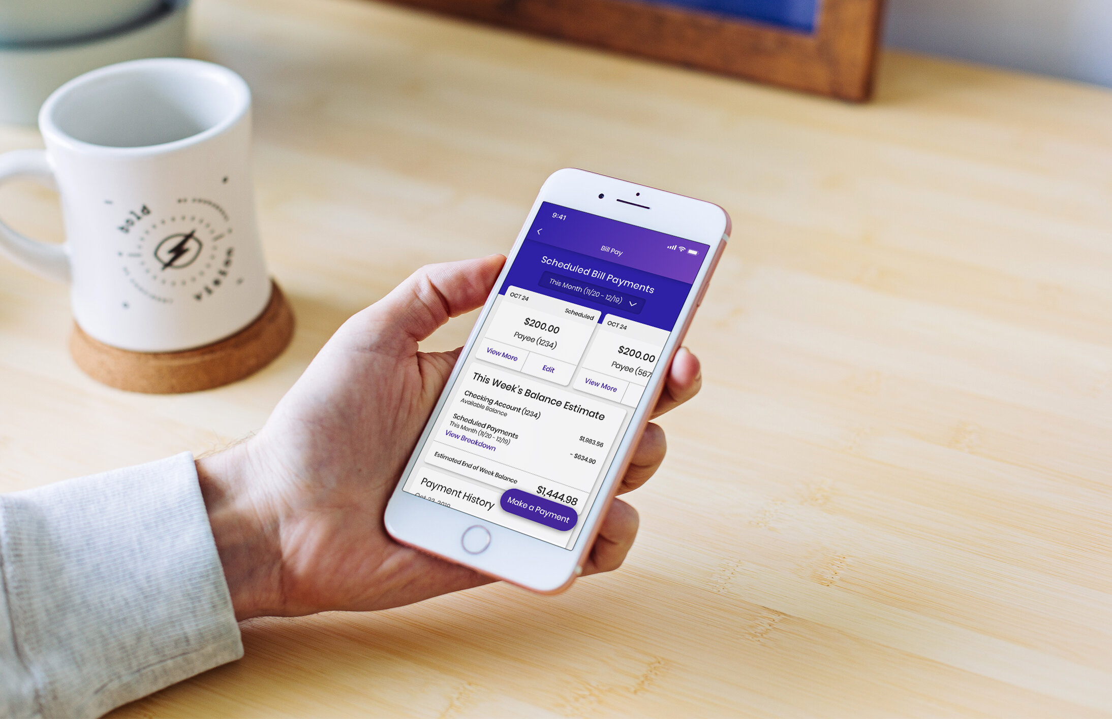
Landing Page
This design ended up being closest to what we actually developed and leveraged mobile-first swiping and was implemented to allow users quicker ability to “connect the balance” of their upcoming payments.
In the new information architecture, I proposed a landing page to house all relevant information in one scannable location - the “One-Stop-Shop” users were asking for. Through this landing page the user could access any needed flows in one - maybe two - taps with a shallow depth of architecture.
After multiple users said they use calendars to track their payments, we explored a “week at a glance” design that was eventually nixed due to level of complexity.
We played with some visual elements here, exploring showing the payments again in a “week at a glance,” this time within spheres.
We also explored showing payments per day, but quickly realized the screen would be blank on days without payments.
✨ Project-specific challenge ✨
For this client program, we worked with multiple agencies across devices to achieve a consistent, holistic customer experience. For the Bill Pay feature specifically, I designed the mobile experience, while another agency designed the web experience.
In order to ensure consistency between web and mobile, we invited the web team into our research sessions and encouraged cross-team critiques of our work. The result of this heightened attention to detail across devices was a Bill Pay experience users felt confident using whether they were on their phone or computer.

Surface
Once the wireframes were in a good place, I began to use our UI Kit branded with our client’s elements to build out the concepts in high-fidelity. UI elements were standardized across the rest of the application to create consistency.
During this process, our team had been busy developing Design Principles to leverage, and these proved to be helpful when working on these high fidelity designs. A principle that specifically helped in this process was Logic over Consistency, as it became clear working on Bill Pay that many new elements needed to be designed instead of always leveraging what we already have for the sake of consistency.
Designing the Landing Page
When thinking about how our landing page was going to be designed in high-fidelity, we conducted three sets of usability tests in order to iterate and create a more tailored experience for our users and their unique needs. As the landing page was new to the application, we focused most of the usability testing on this page to ensure it was fulfilling user needs. From user feedback, we were able to build the page exactly to the job our users were hiring it for, and some of those insights can be seen below in relation to the UI element they influenced.
In our last user test, we conducted quantitative, unmoderated testing on the landing page, and users reacted overwhelmingly positively.
Of 102 users tested, 91% positively rated the new landing page.
Animated Onboarding
As a final touch for the high-fidelity design work, I created four different animations to be leveraged in the Bill Pay onboarding experience, resulting in a 87% positivity rating out of 102 tested users.

High-Fidelity Designs
Due to the project covered by an NDA, I cannot show many high-fidelity designs. The designs below are influenced by the original designs. A large part of our design process, which isn’t shown here, included accessibility considerations. Our team worked diligently to ensure our work passed WCAG AA compliance, pushing back on style guide choices that counter-acted the accessibility of our designs. Such considerations included ensuring there was enough contrast in colors, re-organizing helper text locations to assist with users who use screen-readers, and working with our developers to implement accessibility checks in reviews.

“The information presented is incredibly useful and presented in an uncomplicated way.
The ability to swipe between scheduled payments is just fantastic. I’m accustomed to a much less well-presented financial app, and this is slick, to use a word I don’t ordinarily use.”
- Direct user quote
Support
During the multiple sessions of user testing, we took the time to define the KPI (key performance indicator) goals for how Bill Pay success would be measured once in the app. Using Google’s HEART framework, my researcher and I worked with the client to define what factors were the most important for this feature once it went into production.
As the Bill Pay redesign was prioritized from a development level, I assisted my product consultant in writing user stories defining each new element and uploaded all of my designs to Zeplin for developers to reference. Furthermore, I conducted thorough UI reviews throughout the process to ensure the designs were developed exactly as the approved designs were outlined.
Impact
Over the course of eight months, our work on the Bill Pay feature included hundreds of users tested, multiple iterations of the main user functions and landing page, and countless hours of collaboration across agencies.
91%
positive rating of 102 tested users on our redesigned landing page
124
total users tested through a variety of research methods including usability and jobs-to-be-done
2
main user needs of “connecting the balance” and a “one-stop-shop” successfully uncovered and solved for
#2
highest-ranked feature in mobile app based on customer satisfaction according to JD Power & Associates
What would I have done differently?
Fintech is a tricky business, and when working on this project I wasn’t aware of the ethical implications of designing for a feature like Bill Pay. I’d never even heard of trauma-informed design before, and looking back at the types of conversations we were having with users, that was exactly the type of approach we should have been taking so as to not retrigger people in our interviews. If conducting this type of work again, I would run Consequence Scanning workshops before implementing features like Bill Pay to ensure our work doesn’t increase the harm already created with paying bills. I’d also work to increase the diversity of the people we were targeting in our research, making sure we include users from different socioeconomic backgrounds and don’t design only for the users who were available to speak with us via video chat in the middle of the workday.