Understanding customer needs through rapid prototyping and research.
The details
Date
Jun - Aug 2017
Methods & Tools
User Flows
Prototyping
Wireframing
User Research
Team Structure
UX Design Intern (my role)
UX Designer
UX Researcher
Product Manager
Architect

The task
As a user experience design intern at Kin + Carta (formerly Solstice) I was tasked on a ten-week strategy engagement for a Fortune 500 financial company aimed at increasing their in-store credit acquisition process. I was given the responsibility of one of the main designers on the project and worked with on a cross-functional team consisting of senior designers, researchers, product consultants, architects, and a scrum master.
The problem
Our team was given the question of “How do we innovate the credit card acquisition and issuance process for our users?” After conducting discovery interviews with users, we learned that the current credit acquisition process was cumbersome, slow, and disjointed. Customers were reliant on in-person sales associates, and were often left with little to no communication after a laborious application flow.
The design outcome
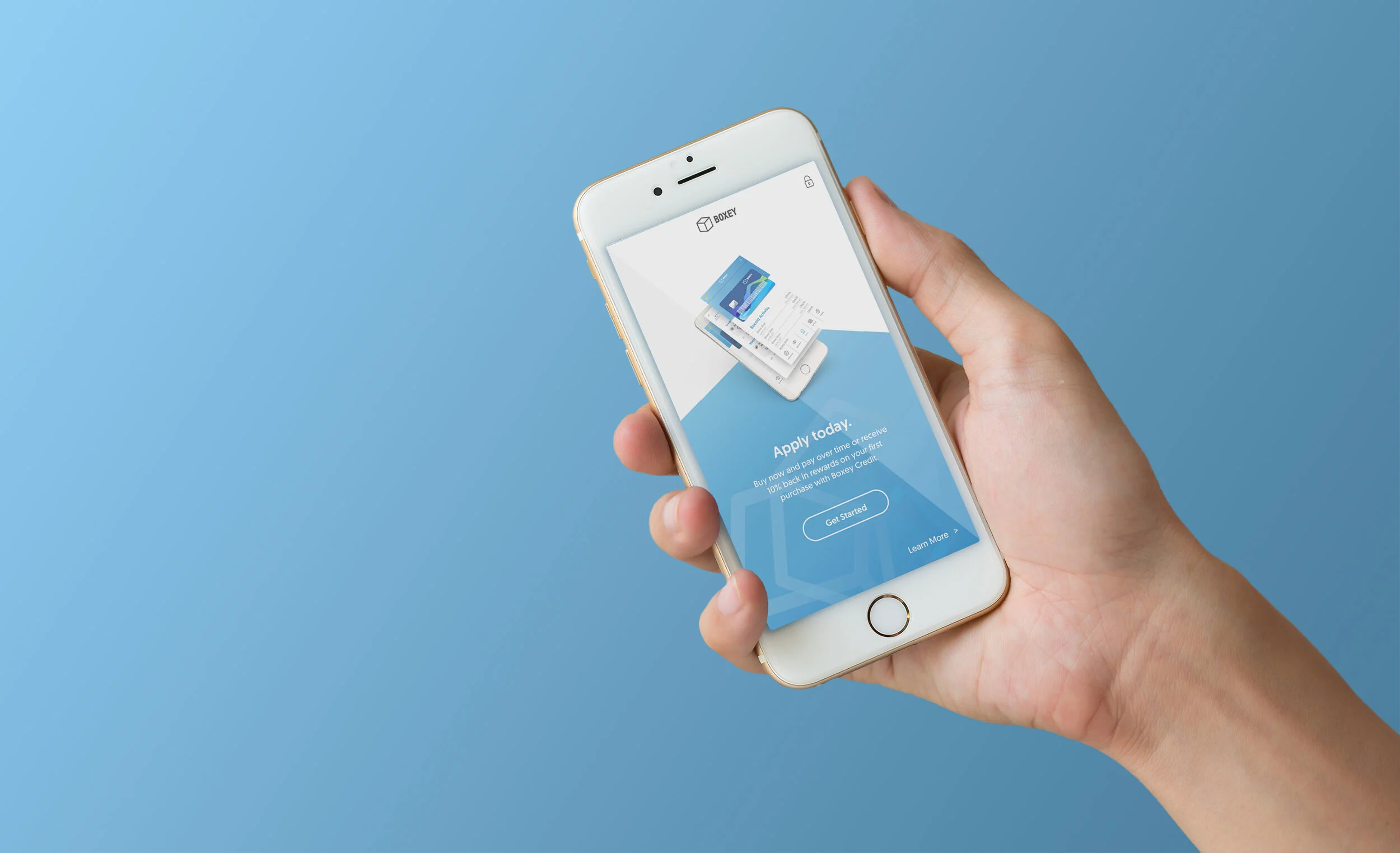
To solve this issue, our team created a prototype of a chatbot-integrated progressive web app (PWA) experience that allowed users to apply, get approved, and use their credit card on a purchase all in one sitting without the sales associate’s assistance. We tested wireframes with users for four weeks, iterating each week and receiving feedback from the client after each iteration. I was responsible for assisting with the research sessions, creating wireframes, and building the final prototype presented to our client’s leadership team at the end of the ten-week engagement.
Future Madison note: the colors chosen for our final designs are not accessible, and would not pass WCAG contrast requirements. Being so new into design at the time, I wasn’t aware of these considerations. Future Madison apologizes for Past Madison’s oversight!
Conversational Flow
Our new progressive web app was created to assist users in signing up for credit while in-store. The conversational flow was designed to mimic the type of interaction you might receive from a sales associate.
Instant Payment
After credit approval, the user is given a digital version of their new credit card which can be immediately used on their next purchase.
The process
Kickoff
To begin the engagement, Kin + Carta hosted a kickoff with the key client partners and product owners who would be working with us on a day-to-day basis. Since this engagement was only ten weeks, timelines moved fast . After the kickoff, the team came back together and devised an interview plan in order to gain more insight from stakeholders on the user and business pain points and goals.
Some of the main user pain points in the current in-store credit card application and issuance process given to us from the client at kickoff included:
Discovery Period
The first three weeks of the engagement were spent combing through documents and listening to stakeholder interviews conducted by our product consultants. The goal of this discovery period was to fully understand the business structure in order to design a potential solution. A quote from one of the stakeholder interviews speaking about the intention of our new product stuck with me:
“We have to give the power to consumers, where they are.”
During this phase, our UX Researcher, Cate Kompare, worked by interviewing a group of current customers for our client, and was able to put together a detailed rainbow report that helped us understand trends and importance of certain features for our customers.
Redesign of an original rainbow report by Cate Kompare
Innovation Session
At the end of the first three weeks, we brought together the relevant product owners and key client decision makers for an all-day innovation session at the Kin + Carta office. During this session, we diverged to converge and brainstormed as many possible ideas for the product based on trends, interviews, and the initial intentions for the product. From this innovation session we were able to uncover hundreds of possible ideas, and began to categorize them into three major sections of the user journey: Finding, Starting, and Using.
We next convened as an internal team and discussed how best to reach our users where they are and the platforms this potential product could live within. We worked from our discovery research to define a list of attributes our new product needed to contain, which were:
Considering factors such as accessibility, scope, and interest in partner adoption, the two main platforms we considered for this product were the progressive web app (PWA) (for faster go-to-market and smaller scope than a native mobile application) and a chatbot (for less reliance on the in-store register associate).
Digital
in the user’s hands, at all times
Instant
credit card issuance for speed of access
Secure
making sure users feel comfortable entering in their info wherever they are
The current user journey
Through conversations with our stakeholders we had a general idea of the current user flow, but it was through our own in-personal user research that we were able to get a clearer understanding of the journey map of a potential user, as well as the pain points of the store associates issuing credit cards.
To conduct this user research, I accompanied our UX researcher Cate Kompare to a partner location of our client as she applied in-person for a credit card on a purchase (she was already planning on making). While doing this research, we were able to understand what information is typically given to users who may want to apply for a credit card. After this initial discovery research, our researcher took her knowledge (along with other discovery research) and shared it via a journey map.
Uncovering the flow
Once we had our initial product ideas approved, our team went straight to work creating wireframes for testing, researching the technical architecture, and creating potential release plans for the product pilot. As UX designers on the team, we were tasked with creating the low-fidelity wireframes to start concept testing our product with users.
However, we began building anything, we needed to understand the user flow in a much clearer way. In order to visualize this flow for the team, I created a robust user flow diagram based on results of team working sessions.
Rapid Prototyping
The next four weeks involved rapid prototyping and user testing of concepts and wireframes. We would test with users once a week, leaving only a few days to iterate, receive approval, and test again. During this time period, I learned two new design programs I wasn’t previously familiar with (Sketch and Proto.io). I then sat in on dozens of in-person user interviews while we tested the prototypes I helped build in real time. After each week, we learned what was and wasn’t resonating with users, and began to build out what eventually became our final prototype. For the purposes of our project, we named our product “Boxey”, as it was a generic brand, allowing potential partners to imagine their own brand.
A major aspect of our experience we wanted to test with users was a conversational UI pattern - which we called our natural language form - that was designed to have users enter information as if they were forming a sentence. We thought this type of information-gathering matched the conversational nature of the in-person experience we were assisting, and users appreciated feeling like they weren’t filling out a lengthy form.
Chatbot Integration
Our product evolved to include multiple points of entry to the experience, including but not limited to SMS text links, QR codes, the partner retail mobile application, and the in-store sales associate. From those points of entry, a convo UX chatbot would walk the user through a series of questions allowing them to understand if applying for a credit card was the correct choice for them at that time.
The experimentation for this chatbot included a proof of concept (POC) created by our developers to demonstrate the power of an automated chat system.
High Fidelity Design Iteration
After testing, we began to work on taking our wireframes into a more realistic state with high-fidelity designs.
Week-by-week, my fellow designer Kate Darmody and I worked through design reviews with the core product owners. During every review, we would take live notes in Google Sheets, listing every piece of feedback, who gave the feedback, and any additional notes.
After each meeting, our team would prioritize each piece of feedback, and work on re-designing the elements the feedback referred to. As we worked through items in the feedback document, we would color-code when each item had been assessed in the designs.
The final product
Since our timeline was incredibly packed, we weren’t able to begin our final deliverable, an interactive Proto.io prototype, until the final week of the engagement. On top of this task, our prototype was to appear fully functioning, using variables and equations I’d never experimented with in Proto.io before. I completed extra hours for my internship to dedicate the time to build out the prototype, which was part of our final presentation to our client’s leadership and product owner team.
Solved pain points
Tap through the final prototype to the right! The main pain points we solved for the client on this project were as follows:
Cumbersome application process
Bringing the user through a digital chatbot and PWA experience allows the application to be at the users’ fingertips
Long and strenuous disclosures and consents
Redesigning the terms and conditions to be more visually pleasing, as well as progressively disclosing information throughout the process to allow for less bottleneck at the end of the flow
Technically-complicated customer authentication
Leveraging a third-party authentication software to allow for instant credit card issuance
Time in “lane” at the POS was too long
Conveniently allowing the application and issuance of credit to happen before the user even walked into line - they are able to instantly have credit to make larger purchases without doing all the work at the POS
The collection of personal customer information was too invasive
Entering in their information on their phone instead of giving their information verbally to the sales associate in line at the register made users feel more secure and comfortable
Too much reliance on the in-store register associate for the application process
By leveraging a chatbot, the user is able to get logical questions answered via SMS without having to ask the sales associate
What did I learn?
This project was my first real-world-adult job, and I was incredibly nervous jumping in and working with designers, researchers, and product analysts who had spent a career honing their craft. I was a kid straight out of college who had boundless energy and was willing to jump in just about anywhere. I still feel like I’m that kid sometimes, but I look back on this project fondly as the true starting point of my career. With this incredible team, I learned the value of actual research - not just that “let’s interview a classmate 15 minutes before the assignment is due” kinda research. This was the first time I spoke to real people about real issues they had in their life, and it sparked in me an interest in user research that hasn’t faded yet.
I finally centered humans in my work, and though we were designing for a Fortune 500 company, it still felt like we were creating something that would positively help people. I also learned the value of my own voice. I was an intern on this project but was treated with as much respect as a senior designer. I wouldn’t learn until later in life how rare this experience was, and I appreciate my team for giving me space to soak up info and grow.